
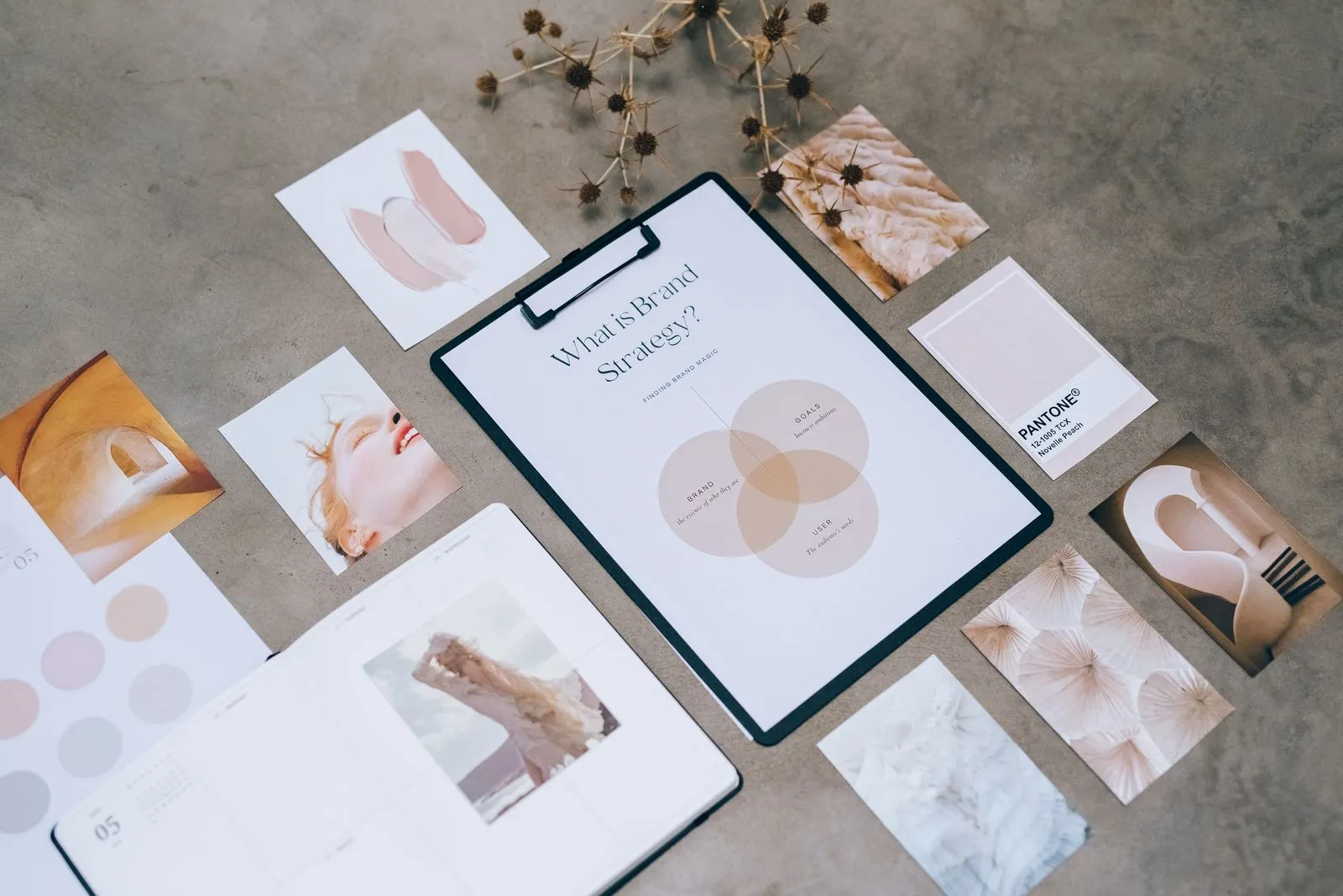
A consistent brand makes it easier for customers to recognize your business across a website, social post, presentation, or printed piece. Consistency does not mean every design has to look identical. It means using a few shared choices—such as colors, type, and image style—so your materials feel connected. A short set of practical guidelines can help you and anyone creating content make those choices with confidence, even when projects happen at different times.
Choose a focused color palette
Start with a small group of colors: one or two primary colors, a supporting color, and neutral shades for backgrounds and text. Record each color as a HEX or RGB value for digital work and a print color reference if you produce printed materials. This makes it easier to reproduce the same shades instead of choosing a close match each time.
Add simple usage guidance. For example, note which color should appear most often, which one works for buttons or highlights, and which colors should not be placed together. Check that text remains easy to read against its background. If a combination feels difficult to read, adjust the contrast rather than relying on color alone to communicate meaning.
Set clear type rules
Choose a typeface for headings and one for body copy, or use a single versatile family with different weights. Include the exact font names and approved alternatives for situations where the preferred font is unavailable. Keep the number of typefaces limited so a flyer, web page, and email still feel related.
Show how to apply the type choices: give examples for headings, subheadings, body text, and small labels. Set basic guidance for alignment, capitalization, and emphasis. For digital materials, check that body text stays readable on mobile screens. Avoid shrinking text simply to fit a layout; edit the copy or adjust the layout instead.
Define your image style
Decide what kinds of images suit your brand. Your guide might call for natural lighting, uncluttered backgrounds, candid moments, or illustrations with simple shapes. Include a few examples that demonstrate the look, along with notes about what to avoid, such as overly busy compositions or filters that change your colors.
Use images that support the message and feel appropriate for your audience. Keep a record of image sources and usage permissions, especially when photos come from outside your business. If different people create content, share a small folder of approved images or visual references so they have a reliable starting point.
Make the guide easy to use
Put the essentials in one accessible document: color values, type choices, image direction, and a few examples of finished materials. Keep the guide brief enough to check during a real project. A one-page reference can work well for everyday decisions, while more detailed instructions can cover specialized needs such as packaging or presentation templates.
Before publishing or sending a design, review it against the guide. Ask whether the colors, type, and imagery match the intended style and whether the information is clear. Update the guide when you make a deliberate brand change, and tell anyone who uses it where to find the latest version. This prevents old files and informal preferences from competing.
Brand consistency comes from repeating a few clear choices, not from making every piece identical. Start with practical rules for color, type, and imagery, then keep them somewhere easy to find. Review new materials against those rules and adjust the guide as your needs change. If you need help creating a usable visual system, Harbourline Design can help you plan one.